caffe mondo
SERVICES: ART DIRECTION | PACKAGING | GRAPHIC DESIGN
-
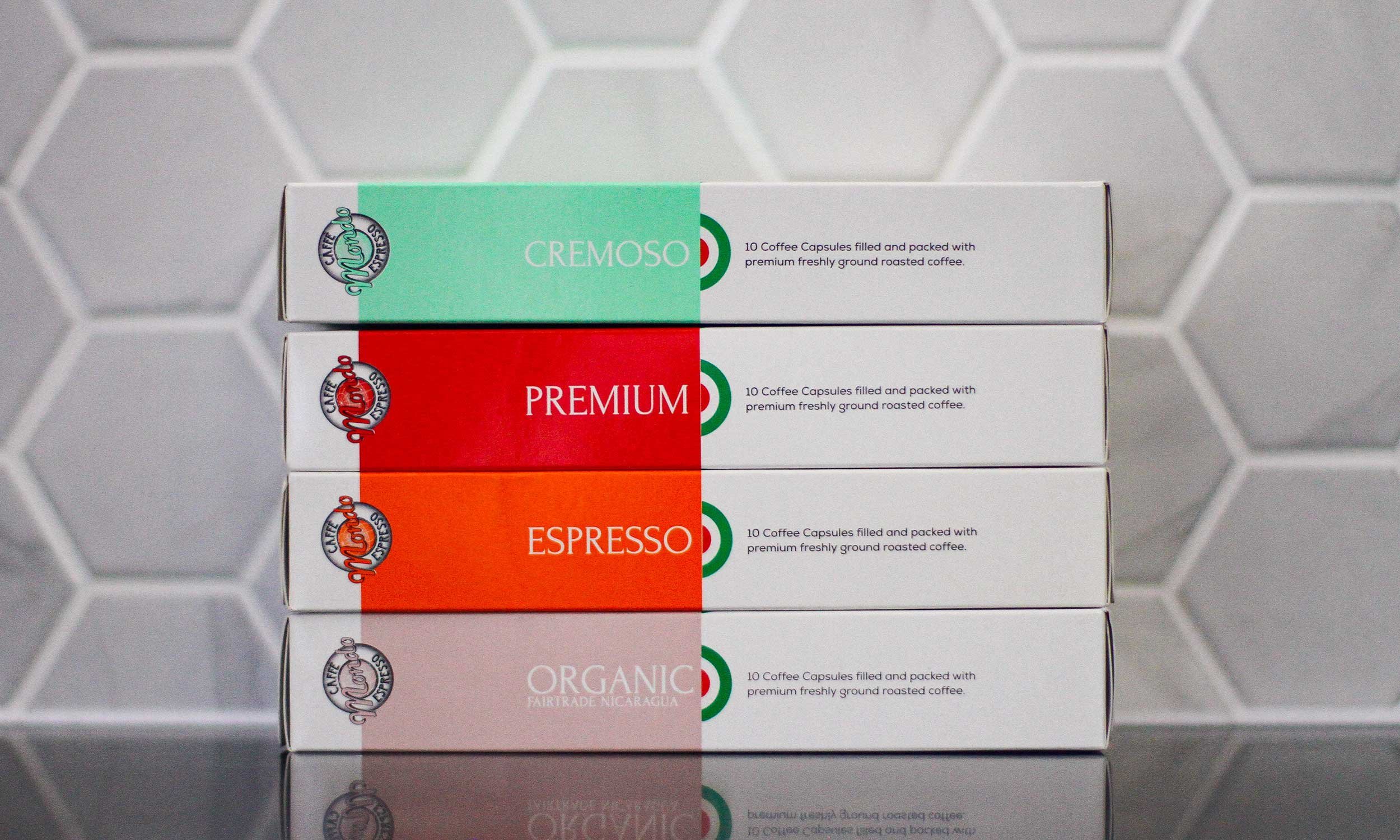
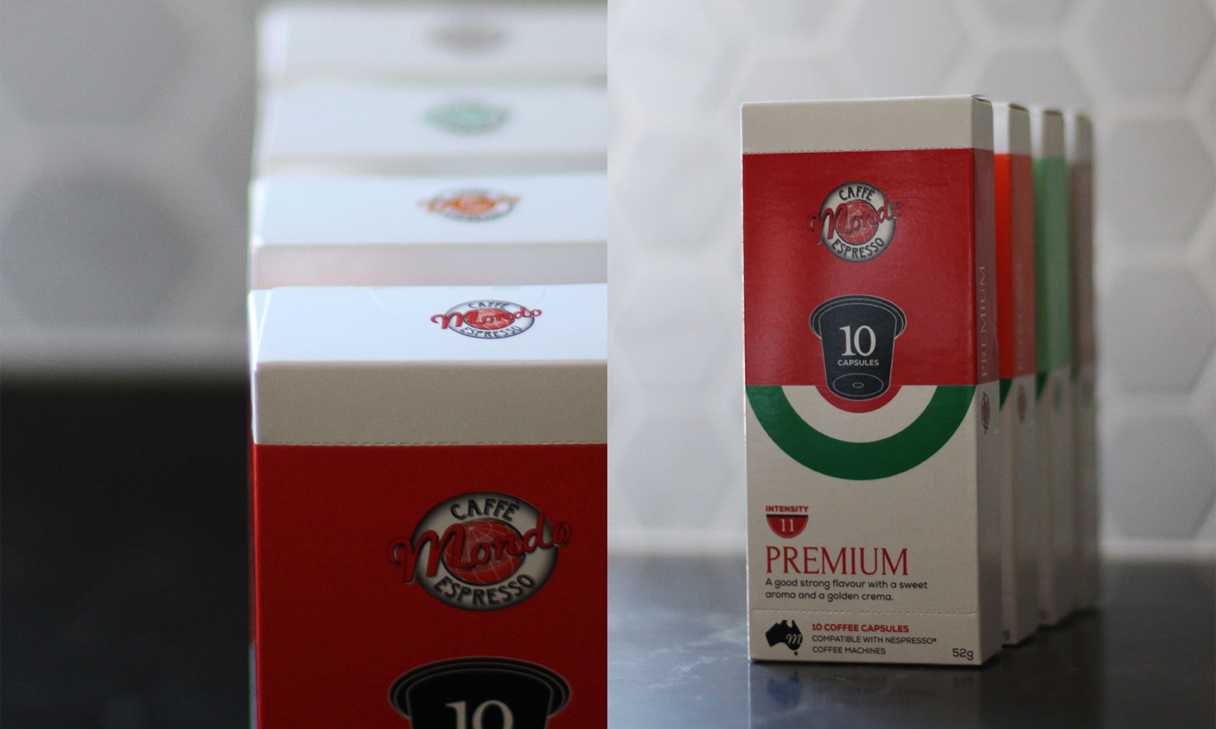
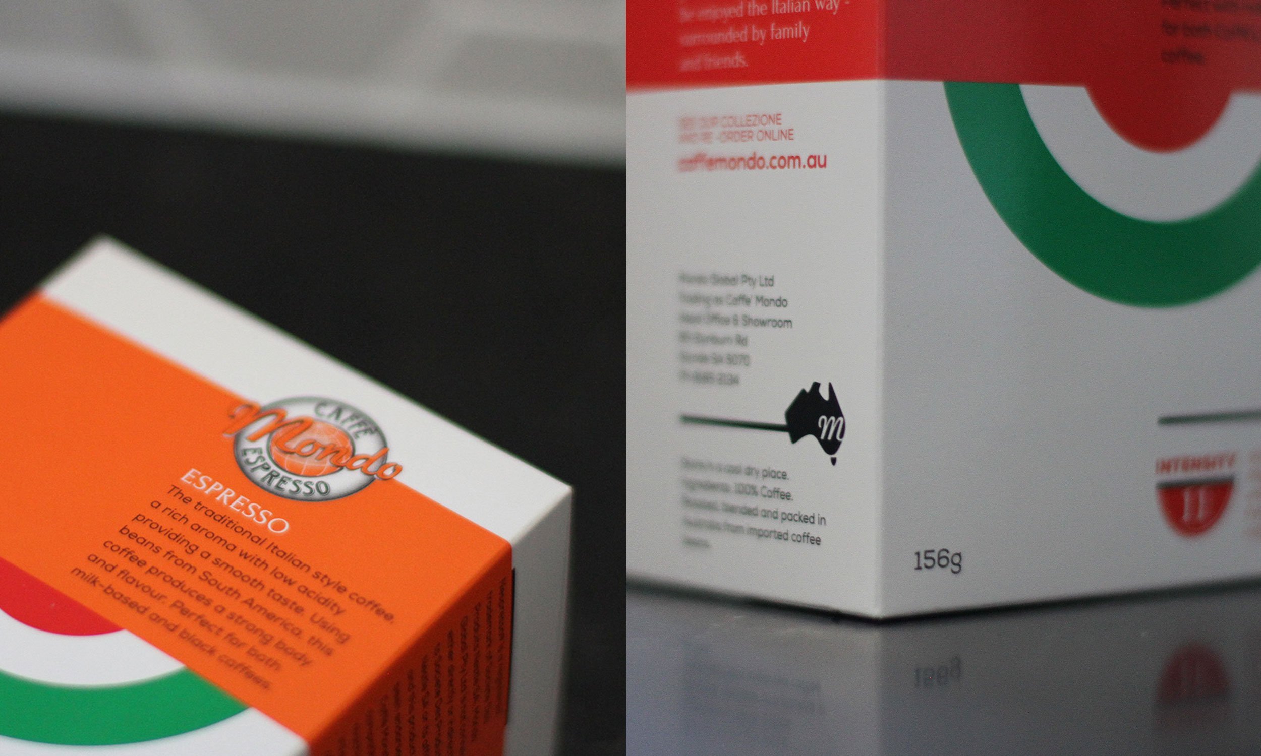
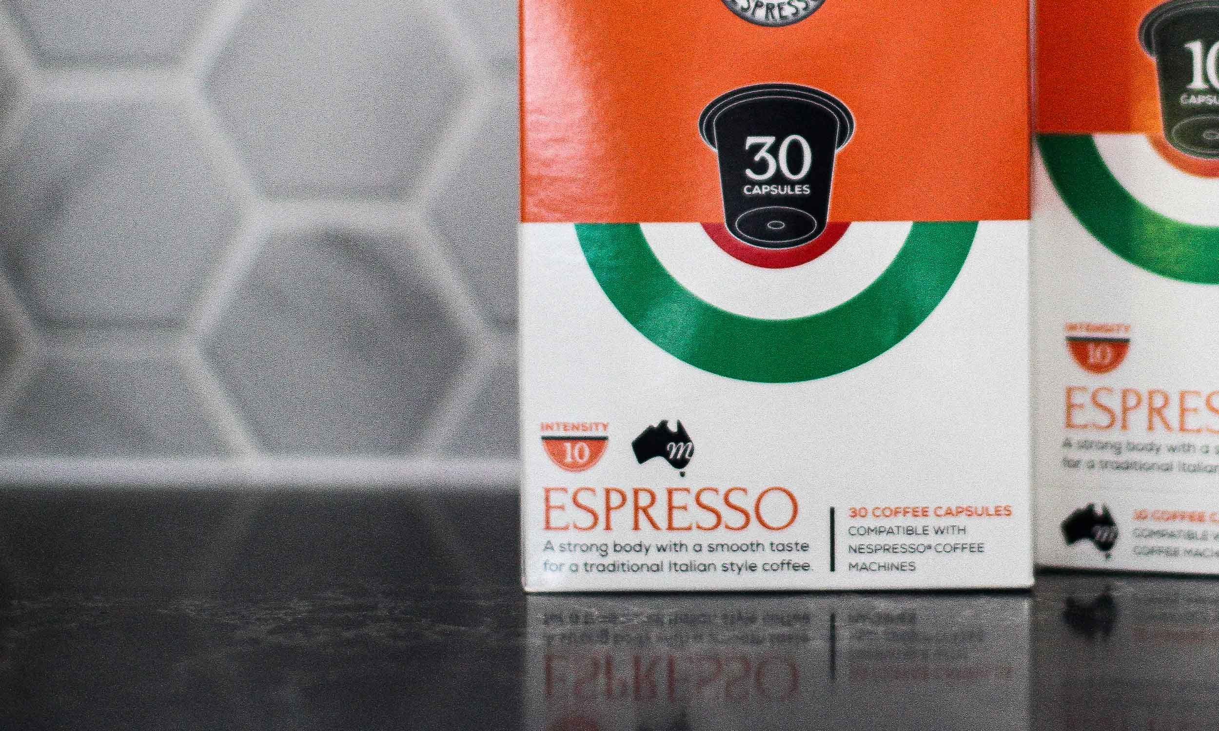
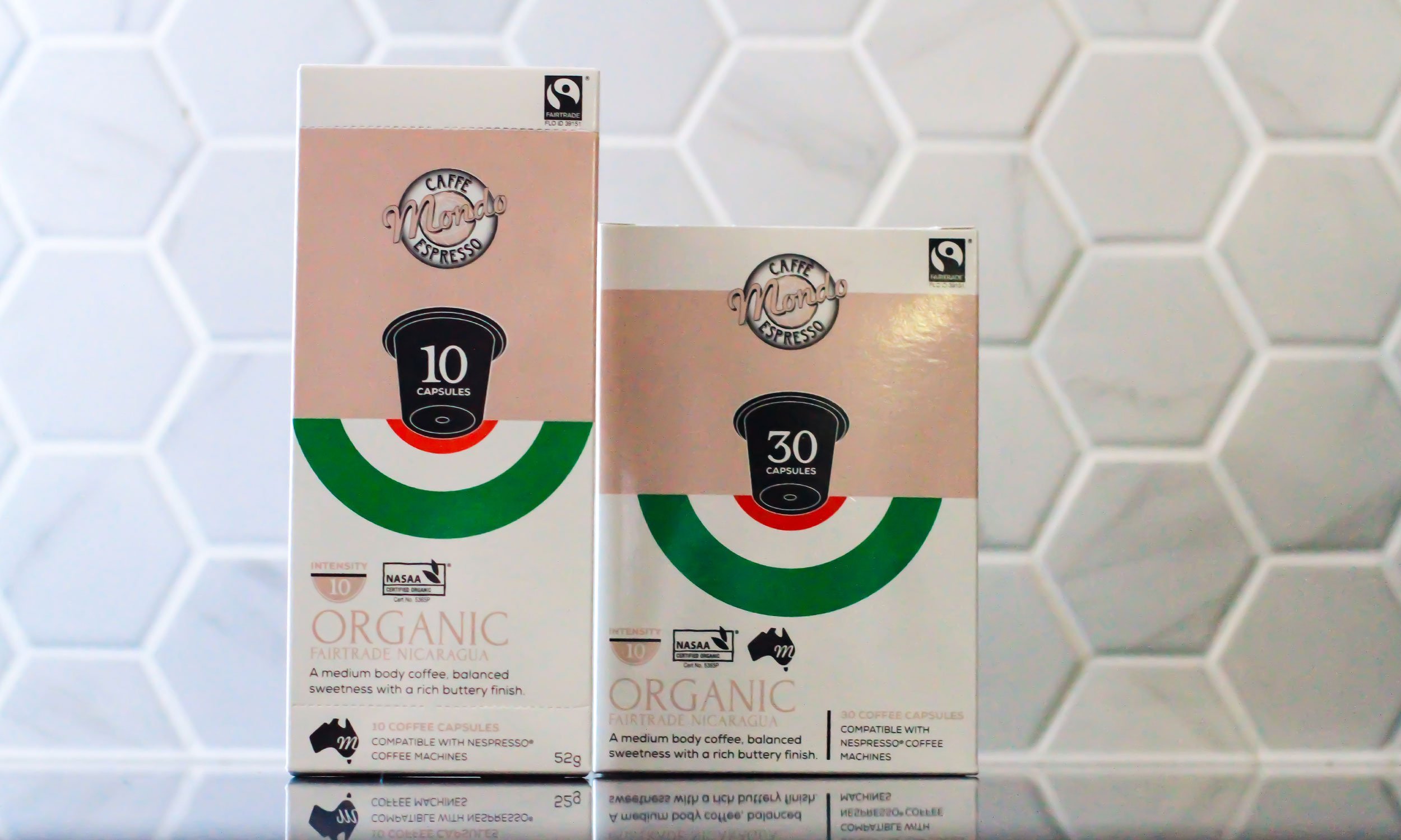
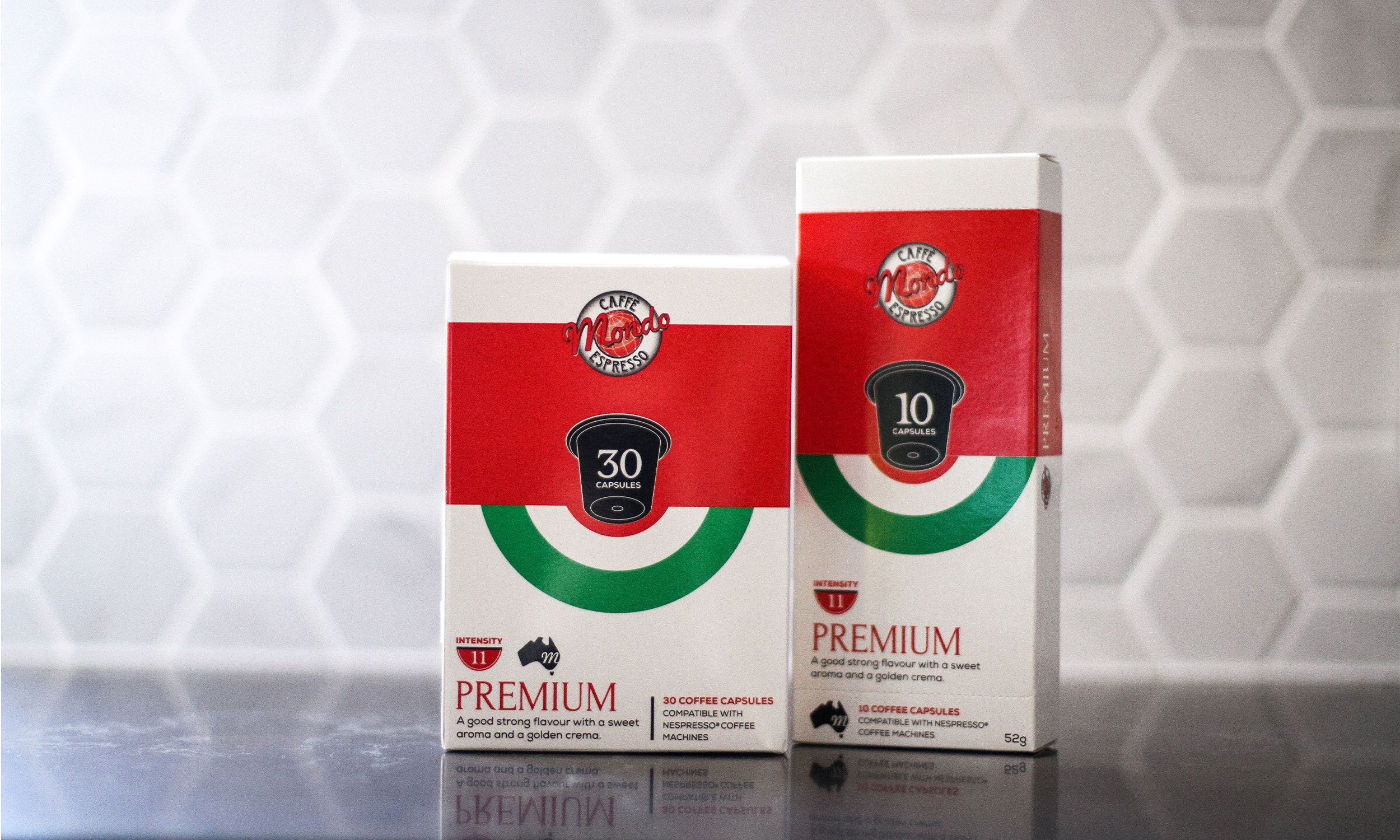
Adrian approached us as he knew from the outset, it was time for a refresh from his pod packaging for Caffe Mondo and upgrades that were required from 10 to 30 box packs. Encapsulating the Mondo style, the brief was to compliment the existing identity and coffee collection colour range, while make it instantly recognisable that his capsules (pods) reflected an Italian flavoured brand. We used a strong half circle and cup type approach and incorporated the Italian Flag. In comparison to Caffe Mondo’s competitors in an oversaturated market place, from our research, it was evident in retail that a strong colour block against a white packaging would draw attention to the consumer and offset the minimalist approach. This had not been presented before in their coffee capsule category. The addition of the illustrative capsule and qty icon took centre stage on the packaging and created simple, clear pick up appeal which to date, has stood out on local supermarket shelves.
